MAX/Center Referrals Form Re-design Validation
About This Project
After the research for the MAX/Center referrals process was completed, I added design requests to the UX backlog for fixing some of the usability issues of the form. To ensure that the new design was in fact meeting user needs, I recommended conducting a quantitative unmoderated usability test on the new design. The goal of this effort was to carry out that test and share any improvement recommendations with the product team.
Client: RE/MAX LLC
- Real estate franchisor
- Generates income from franchise fees
- Provides MAX/Center web application to franchisees
Business Problem and Target User
The MAX/Center referral feature was designed to help agents across the globe connect and share referrals (which for some agents is their whole business). We have observed that
- users are not happy about the length of form,
- there's dissatisfaction with the referral fee agreement piece,
- and there's dissatisfaction with contact sharing,
which is causing networks members to avoid referring business to each other within our platform. How might we improve the process of referring business to other agents in MAX/Center so that our agents are more successful as determined by an increase in the number of referrals sent within MAX/Center?
Team and Role
Role: UX Researcher
Stakeholders
Product Manager
Product Owner
Constraints and Scope
- While setting up the usability test in Maze.design, I discovered that some design elements in InVision, such as the price slider, wouldn't work the same way they do on a live website.
- Maze.design returns the user to the top of the next prototype screen which created extra scrolling for participants.
- The prototype had paths for expected routes but not every possible route.
Creating Task Scenarios
Tasks scenarios covered the most frequent pain points of the form from the usability testing sessions.
- Entering a referral fee
- Entering an additional contact person
- Saving progress
- Entering home price ranges
- Entering details about a property
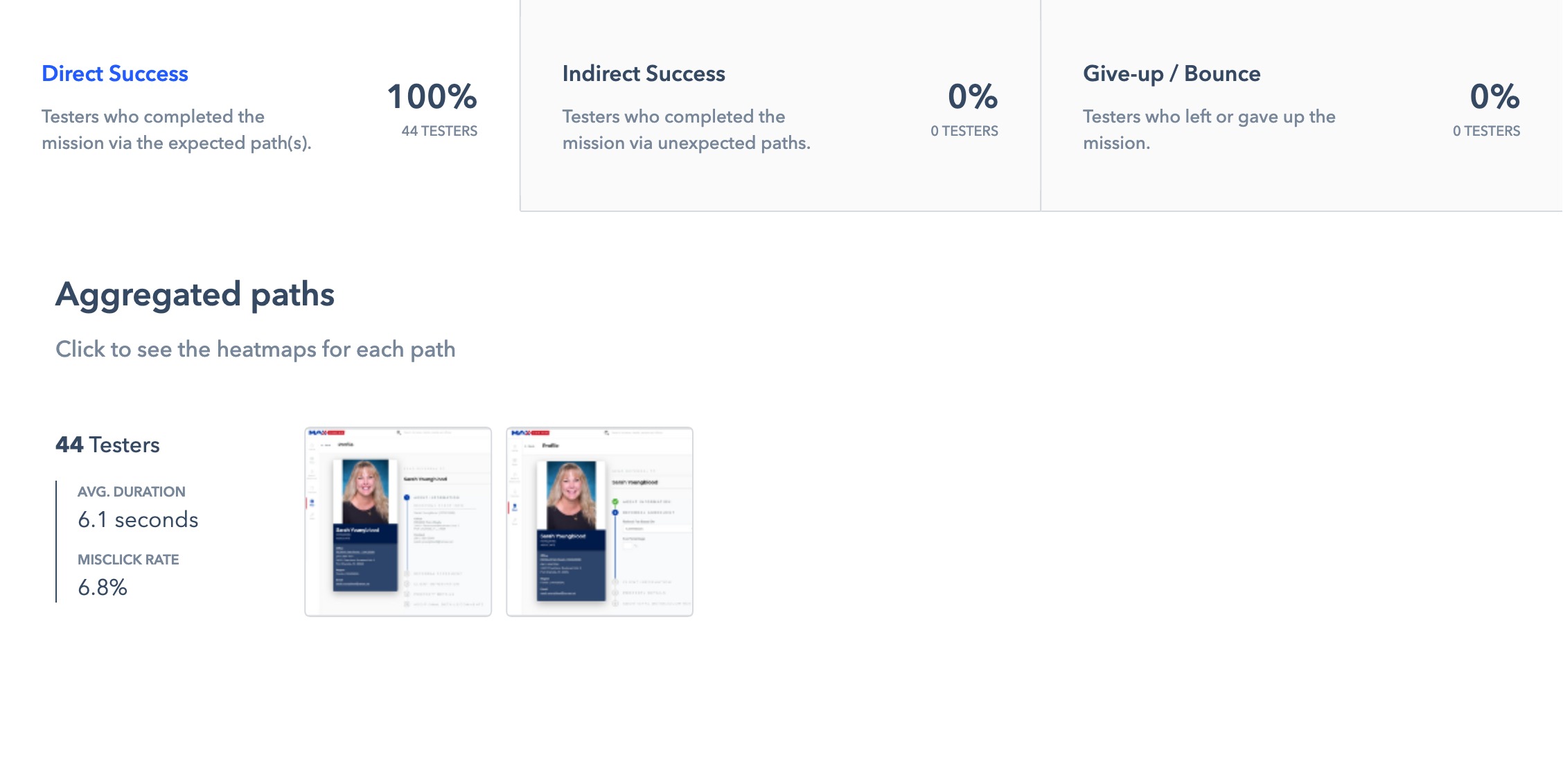
Usability Test Results
 View Report
Recommendations
After reviewing the results from Maze.design and considering the limitations and expected problems of the prototype, the design performed well overall. I had a few recommendations for items that could be revisited.
- Revisions to the design could clarify and emphasize that the user is located on the referral form.
- Brokers and agents may feel more comfortable moving through the form if required fields (if any) are marked.
- To emphasize that the text fields with the price are also editable, a revised design could explore visual cues that help brokers and agents understand they can type in the field.
Retrospective and Lessons Learned
One of the difficult trade-offs that arose in setting up this usability test was deciding what to do for the home price range task scenario. The slider interaction in InVision didn't mimic what a user would expect to happen on a live website. Ultimately, I decided to focus that task on testing the text fields for the home price instead and made a note to account for poorer usability results for that task. The UX and product teams discussed this limitation of InVision and Maze.design and decided that we needed to do more research on other unmoderated usability testing tools that may perform better with these types of functionality.